

I've often lamented the snarky tone and ADD brevity of the web, but I've also scorned the resistance of mainstream printed media to intelligently and unflinchingly re-assess their ailing industry. I'm speaking in broad strokes here, but where one medium has written itself into irrelevance by reporting staid news to an ever-shrinking audience (newspapers), the other medium has established an overly-democratic overabundance of shallow content (the internet). If you stop and look at the two outlets, then you come to realize that both in fact suffer from a similar flaw: a lack of well-considered news.
Now, that's not to say that you can't find good writing in both. Old standards like the New York Times continue to support incisive editorial writing and good columnists, and some blogs and websites offer analysis and reporting to rival the best of the traditional media. But part of the appeal (and shortcoming) of the internet is the openness; anyone can post their own take on the news without the oversight of fact checkers or editors. Sometimes this works, and sometimes this devolves into self-indulgence.
The issue (in my mind) is that as the internet has courted the market share traditionally held by newspapers, those papers have frantically tried to ape the qualities of the web - namely short, quick stories with little shelf life and a casual tone. Very infrequently has the internet tried to mimic newspapers. And why should they? They seem to be doing just fine as they are. But this begs the question: if the internet focuses mainly on up-to-the-second news and personal opinion - and newspapers try to follow this lead - then who is left to cover long-lead stories and in-depth investigative reporting? I have a hard time seeing the internet stepping up to fill this role.
I've spoken a few times with people about whether or not blogging encourages sloppy writing. The counterargument runs that the text is what matters, the rest is just container. To them, you could write a novel on a stack of post-it notes. But I think if you set out to write on post-it notes, you'd simply end up jotting down reminders. Humans suffer from a bias of "functional fixedness" - we're not, as a species, particularly good at imagining new uses for old tools. Once something works for a particular problem, what's the sense in shaking things up? There are many great writers throughout the span of the internet, but most people have trouble seeing the point in using the tool for anything other than gossip, banter, and infotainment. And even those who do see the point will have trouble finding any way to generate an income to fund good writing, good reporting, and investment in a news story.
But these are just musings. I don't have any answers about just how exactly newspapers will continue, or whether the internet will assume the many abandoned posts of traditional journalism. I think there is a great potential in both forms and have an unabashed love of each (for different reasons). But lingering on print for a moment, I have some hope for the future thanks to inspiring experiments like the McSweeney's Panorama.
I received a copy in the mail back in December and just finished reading it (all of it) last week. I can honestly say that I've never read that much of any single newspaper. I read the cover, the op-eds, the Book Review, the sports section, the arts coverage, the Sunday Magazine, the comics, and the food section. And I read a whole lot more that wouldn't easily fit into any previous newspaper I've ever seen.
But it wasn't a real newspaper; it was a one-off conceit of a literary magazine, an attractive daydream of what a newspaper could be. This is not to fault McSweeney's, just to acknowledge that the medium hasn't yet been revived. In truth, McSweeney's was probably the best possible outfit to attempt a project of this scope (320 pages! 150 contributors!). They have a breathless enthusiasm apparent in all of their ventures. Their approach is certainly infectious.
As I paged through each section on my first time looking at the paper, I kept interrupting A to exclaim at whatever new spread I held up in wonder. The whole experience felt like revisiting a childhood tradition. Lingering over a newspaper is one of those experiences that we sadly reserve today for those rare, lazy Sunday mornings. In reality, the experience of delving headlong into a newspaper should happen much more frequently.
The diversity of subjects is amazing. In the course of reading The Panorama, I read about DVD cover art, the environmental impact of Mendocino County marijuana operations, the 49ers, the Bay Bridge, lamb butchering, an out-of-print novel by an Irish author, and the reasons behind choosing public education for your child. Say what you will about the glories of the internet, but it strikes me that newspapers were the original form of rhizomatic learning, weaving an ever-deepening web of relationships, new leads, and wide-ranging (but interconnected) ideas.
Oh, and the design. What design! A large part of the pleasure of skimming the Panorama is sensory - 15 x 22" broadsheet pages with full-color, full-spread images. There are simply some things the internet (or, more accurately, a computer screen) can't approximate, and that is exactly the strength of McSweeney's newspaper gambit: to highlight the unique strengths of printed media. In-depth, lengthy stories; gorgeous design; immersive imagery. It would be a shame to lose these things to text-heavy, design-ignorant websites, but they already happen to be rare in newspapers. Perhaps this will serve as a wake-up call for newspapermen to embrace the limitations (and glories) of their medium.
I have a real fetish for printed objects: books, magazines, journals, daily and weekly newspapers. Let's hope The Panorama wasn't a last hurrah, but a rallying cry for creative explorations of the form.
Monday, February 15, 2010
the newspaper is dead, long live the newspaper.

Wednesday, October 7, 2009
ps

Through a summer of job transitions, art festivals, and over-extending ourselves with Slow Food, this blog has been pretty quiet. To get back into a rhythm, it's probably a good idea to look back, but, since I'm not overly ambitious, I won't be looking back very far.
Earlier this week, I walked over with a few of my co-workers to visit a pop-up publishing house. Publication Studio, the brainchild of Matthew Stadler and Patricia No, has squatted in the Ace Hotel Cleaners, where they are cranking out small-run novels and books. So far, they've published a catalog for a local gallery show, two short debut novels, and an annotated urban planning reader. When my work descended on the studio en masse, we bought them out of their day's printing of Lawerence Rinder's thinly-veiled fiction about his time as a curator at the Whitney. I guess working at an arts organization has made us predictable
It's true that I love a good book project, but I also love a good machine. To publish their on-demand books, the PS team has a high-speed duplex printer, a paper trimmer, and - to seal the deal - a perfect binder. I could watch this dreamy little video all day:
Publication Studio Makes A Book from Mike Merrill on Vimeo.
So far, I've been really impressed by what PS has released, and they already have exciting projects lined up through fall. In late October, they'll be participating in the 2009 Amsterdam Biennale, a decentralized art fair with satellite pavilions operating around the world. Portland's contingent will print a collection of single-run artist books, including some by two of my friends and co-workers. I'll certainly try to attend kick-off party on the 24th, with on-the-spot collaborative writing and early-morning gin. It's good to know that some (more creative) parts of the publishing industry still have a reason to celebrate.Saturday, June 20, 2009
new york glimpses: written city
For an amateur type-geek, New York is a veritable specimen book of fantastically quirky found signage and lettering. There are literally entire city-blocks worth of hand-lettered signs, molded plastic type, painted announcements, and bizarrely expressive awnings. If it weren't for my overwhelming fear of looking like a tourist, I would have been walking the streets with my camera out, wildly snapping photos of every storefront we passed.
I did still manage to take a few pictures of some of the awesome vernacular type I saw on our trip, mostly in Coney Island. To be honest, that was my main impulse for heading down to the boardwalk; Coney is like a musty old collector's basement full of ephemera. The beachfront is a collision of arcade neon and hand-painted, hyperbolic side-show banners. And it sadly won't be around for much longer before it begins to look like an Atlantic City resort. I try to imagine if Coney ever looked classy, or if it always just felt like a bit of working class exoticism. Either way, it has a uniquely nostalgic feeling that I hope they can preserve.
On that note, here's a little photographic interlude between our food-fueled travel stories:
If this slideshow was a little heavy on design and a bit light on edibles, you can always see the rest of our photos here.
Friday, April 17, 2009
unplanned city
This clip is a few years old, but I've always gotten a kick out of it:
It's goofy, but it's also such a simple conceit for an ad - just use the damn shoes, right? No celebrity needed. And yet, I think what really makes the ad so cool is that it is totally unexpected to see this guy vaulting himself over and across the urban spaces that are designed to move people in very different and proscribed routes. Cities dictate model for their own "ideal" usage, while individuals will invariably personalize and flaunt those impositions.
In Portland, as much as we pride ourselves on a DIY ethos, we also tend to *heart* our progressive city government. This means we often end up relying on a top-down sort of urban development. I think it's a good thing that our city can build lasting, meaningful infrastructure, but it also spares us (for better or for worse) the birthing pains of coming up with creative solutions on our own. I'm thrilled by every new bike lane the city stripes, even if they're handed out like candy, but sometimes the trade-off of this fast-track urban development means cluster-f**ks like the Rose Quarter re-development.
So what happens in other cities where citizens have to go it alone to create a livable environment? The Canadian Centre for Architecture in Montreal is holding an exhibit through this weekend called Actions: What you can do with the city, and I just came across their awesome Tools for Actions site, which shares all 99 projects from the show. The centre (er?) gathered both proposals and completed designs from around the world, all of which co-opt existing city structures to create the building blocks for new urban interactions.
Rather than treating existing city plans as obstacles, the groups featured in Actions employ them as unintended stages for talking about community and sustenance. The exhibit offers so many cool, new ideas based on everyday actions like mapping, walking, recycling, and biking, that you could easily spend hours reading the briefs and then tracking down more info on the firms and artists involved. I know I can be pretty food-focused, so it's no surprise that projects like urban foraging, plastic bag gardens, and a city-wide picnic caught my attention. Spend some time looking at all of the actions, some of which might inspire you to change your city on your own. A little guerrilla gardening, anyone?
I wish I was in Montreal to see this stuff live. And I wish Portland had museums that could actually draw these sorts of exhibits. Maybe that's a potential "action" itself.


Monday, February 9, 2009
infographics
Recently, I read my first book by Edward Tufte, Visual Explanations. Brilliant! Tufte's obsession is with improving how we share and use ideas and, to that end, he's written a series of books examining and critiquing the information design of charts, graphs, tables and diagrams. This may sound like I'm starting off a really dry post here, but his book was unbelievably fasciating and really beautiful. Since he couldn't find a publisher who would produce the books to his standards (and that means full-color photos, annotations and moving flaps), Tufte has committed himself to self-publishing. The results are like pop-up books for designers! Just look at this page from the book that explains the importance of scale:
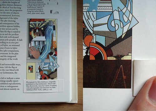 The Lichtenstein mural looks small as it's printed on the left
(until you see the artist standing next to it). It's all relative.
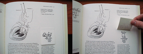
Basically, Tufte shows that the same rules apply to visual information design no matter the subject and, at the base of all of these examples, everything is subjective. Just by omitting certain details or changing the color-coding or scale, Tufte points out how the same data can be used to reach drastically different conclusions. I never thought I'd be particularly interested in the the first epidemiological study of a cholera outbreak, but with the right design, I was enthralled.
Ever since reading Tufte's book, I feel like I've been on the patrol for well-designed charts and diagrams. If you spend enough hours on the internets, you're bound to find something worthwhile.
GOOD magazine has, across the board, pretty exceptional design. I guess that it's what happens when a bunch of design-savvy, future-obsessed progressives found a magazine. Good stuff. As part of their work, they produce really engaging videos for their Transparency series that detail hidden costs and overlooked facts about the world we live in. Just take a look at this sharp clip about water resources:
Hot. Last year, they also launched a brief series of broadsheet-style charts that gave a sort of "state of the union" in the months surrounding the election. Their GOOD sheets applied beautiful design to explaining historically slim election margins, immigration rules in the US, the "first 100 days" of a Presidency, and holiday-season shopping.
While the graphs and charts that GOOD produces tend towards the macro, a new website, called Daytum, gives a stylish way to track the highly idiosyncratic details of your personal life. In early December, I set up my own tracking and have been trying to diligently record some of the mundane things I think and do. In my mind, this is what Twitter and Facebook and all of those social networking sites should have been - just the facts, well-designed, and slightly comical. The holidays lent themselves perfectly to quantification - now I know exactly how frequently I hummed "Little Drummer Boy" to myself (9):

I have to say that after two months of following a few statistics, it can be tricky to keep it spontaneous. When I log in to record one change, it's hard not to end up thinking, "Do I have anything to change on these other charts?" Then it becomes an issue of influencing the results of the "study." Did something actually change, or am I making up a reason to adjust the numbers to keep things interesting? I should ask my sociologist wife about this.
Given the slick design and tip-top usability, it shouldn't be surprising that Daytum is the brainchild of Nicholas Felton, a shockingly obsessive and talented designer who's best known for his Annual Reports. No, not like "really well-done reports for major companies" - more like "really hyper-detailed reports for the minutae of his daily life." Just look at this spread from the 2008 report:

If that seems detailed, you should know that the maps included in the printed version of this year's report can be assembled into an icosahedron globe of his movement patterns. I absolutely love this guy and I'm amazed by how his brain works.
But Felton's definitely not alone in his rigorous self-observation. He was invited by PRINT magazine, along with a few other diligent data recorders, to follow a single week using a medium of their choice. The results, captured in photos, drawings and charts, show everything they consumed. While I found this project clever, the neurotic tracking of certain others can begin to give me the jeeblies. The Quantified Self is a new movement for greater understanding of our lives, beginning with more detailed recording. As you can read in this article from GOOD, its adherents chart their pains, sleep cycles, sex, calories and mood. As much as this stuff fascinates me, I have no interest in weighing my food and counting my breaths. For now, you'll just have to put up with my tracking the foods I wish I were eating. Not that you probably want to know any more than that.
Sorry if this is falling into a bit of rambling, but there is really just so much of this stuff out there to enjoy. If you want - no - if you need more charts, Visual Complexity provides a clearinghouse for visual data mapping. Some of them are just pretty to look at.
There is also this taxonomy of heavy metal band names.
In a long string of web-recorded personal geekery, let's just look at this post as keeping up with tradition.


