
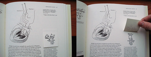
Recently, I read my first book by Edward Tufte, Visual Explanations. Brilliant! Tufte's obsession is with improving how we share and use ideas and, to that end, he's written a series of books examining and critiquing the information design of charts, graphs, tables and diagrams. This may sound like I'm starting off a really dry post here, but his book was unbelievably fasciating and really beautiful. Since he couldn't find a publisher who would produce the books to his standards (and that means full-color photos, annotations and moving flaps), Tufte has committed himself to self-publishing. The results are like pop-up books for designers! Just look at this page from the book that explains the importance of scale:
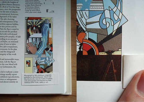 The Lichtenstein mural looks small as it's printed on the left
(until you see the artist standing next to it). It's all relative.
Basically, Tufte shows that the same rules apply to visual information design no matter the subject and, at the base of all of these examples, everything is subjective. Just by omitting certain details or changing the color-coding or scale, Tufte points out how the same data can be used to reach drastically different conclusions. I never thought I'd be particularly interested in the the first epidemiological study of a cholera outbreak, but with the right design, I was enthralled.
Ever since reading Tufte's book, I feel like I've been on the patrol for well-designed charts and diagrams. If you spend enough hours on the internets, you're bound to find something worthwhile.
GOOD magazine has, across the board, pretty exceptional design. I guess that it's what happens when a bunch of design-savvy, future-obsessed progressives found a magazine. Good stuff. As part of their work, they produce really engaging videos for their Transparency series that detail hidden costs and overlooked facts about the world we live in. Just take a look at this sharp clip about water resources:
Hot. Last year, they also launched a brief series of broadsheet-style charts that gave a sort of "state of the union" in the months surrounding the election. Their GOOD sheets applied beautiful design to explaining historically slim election margins, immigration rules in the US, the "first 100 days" of a Presidency, and holiday-season shopping.
While the graphs and charts that GOOD produces tend towards the macro, a new website, called Daytum, gives a stylish way to track the highly idiosyncratic details of your personal life. In early December, I set up my own tracking and have been trying to diligently record some of the mundane things I think and do. In my mind, this is what Twitter and Facebook and all of those social networking sites should have been - just the facts, well-designed, and slightly comical. The holidays lent themselves perfectly to quantification - now I know exactly how frequently I hummed "Little Drummer Boy" to myself (9):

I have to say that after two months of following a few statistics, it can be tricky to keep it spontaneous. When I log in to record one change, it's hard not to end up thinking, "Do I have anything to change on these other charts?" Then it becomes an issue of influencing the results of the "study." Did something actually change, or am I making up a reason to adjust the numbers to keep things interesting? I should ask my sociologist wife about this.
Given the slick design and tip-top usability, it shouldn't be surprising that Daytum is the brainchild of Nicholas Felton, a shockingly obsessive and talented designer who's best known for his Annual Reports. No, not like "really well-done reports for major companies" - more like "really hyper-detailed reports for the minutae of his daily life." Just look at this spread from the 2008 report:

If that seems detailed, you should know that the maps included in the printed version of this year's report can be assembled into an icosahedron globe of his movement patterns. I absolutely love this guy and I'm amazed by how his brain works.
But Felton's definitely not alone in his rigorous self-observation. He was invited by PRINT magazine, along with a few other diligent data recorders, to follow a single week using a medium of their choice. The results, captured in photos, drawings and charts, show everything they consumed. While I found this project clever, the neurotic tracking of certain others can begin to give me the jeeblies. The Quantified Self is a new movement for greater understanding of our lives, beginning with more detailed recording. As you can read in this article from GOOD, its adherents chart their pains, sleep cycles, sex, calories and mood. As much as this stuff fascinates me, I have no interest in weighing my food and counting my breaths. For now, you'll just have to put up with my tracking the foods I wish I were eating. Not that you probably want to know any more than that.
Sorry if this is falling into a bit of rambling, but there is really just so much of this stuff out there to enjoy. If you want - no - if you need more charts, Visual Complexity provides a clearinghouse for visual data mapping. Some of them are just pretty to look at.
There is also this taxonomy of heavy metal band names.
In a long string of web-recorded personal geekery, let's just look at this post as keeping up with tradition.


1 comment:
Nice post, you've got some real goodies here. Heavy metal taxonomy is hot. I have three Tufte books if you want to borrow them...
Post a Comment