
Tuesday night, A and I rounded up some friends for a little "tee time" at the 4th Annual Holocene Minigolf Art Invitational. Each year, the organizers enlist a roster of artists, designers, galleries, and stores to build out their dream putt-putt holes. In past years, there have been 3-D fun houses, giant labyrinths, life-size atari games, and a whale with an air-jet blowhole that ejected your golf ball. People get seriously ambitious - it almost puts the Adult Soapbox Derby to shame.
This year, I'd say the course was even stronger and the holes were definitely more playable. One green was populated with fey garden creatures and over-sized, candy-colored radish flowers. Another was a modeled critique of our crazy car-culture and freeway system. Free pancakes (and self-esteem boosts) were served for every hole-in-one. And overtop of it all, they projected Caddyshack on the walls and hosted club-circuit regulars to DJ the festivities. It's that classic love-it or hate-it Portland event. You either embrace the self-aware, irony-laden quirkiness or end up muttering bitter things about the "creative class."
But if you're too busy wandering around sulking over hipsters, you might get nailed by a vicious windmill with its fast-moving ceiling fan blades!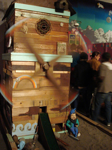
And wouldn't that just be a horrible way to go? Getting a concussion from a salvaged-wood cabin covered in dream catchers and garden gnomes. Ha!
Even though most of my photos were drunkenly blurry (the tournament is held at a bar, afterall), I did manage to find one of my favorite holes online:
Everyone else was really into the mustachioed bunny, but I would have taken home that little Indian headdress bird in a heartbeat. He's like a lazy-eyed neo-hippie. Priceless!
You can see more (re: less blurry) photos on the Portland Mercury's website.
Thursday, February 26, 2009
putt putt putt
Thursday, February 19, 2009
pok pok express, now servicing new stops
I think people are generally surprised at our answer when they ask A and me to name our favorite restaurant in Portland. The quizzical looks on their faces always betray that they were expecting a refined, European-inflected restaurant or a rustic, farm-to-table bistro in the vein of Chez Panisse. Sure, there are plenty of both in our top 10 list, but no, our favorite is a Thai place. Granted, this certain Thai place happens to be Pok Pok, so anybody who's surprised at out choice must never have been there.
I'm not quite sure how to write about Pok Pok without embarrassing myself (or A). Whenever I tell people about this place, I tend to get a little worked up, mixing up my words and talking a bit too loudly. But seriously, the food is un-damn-believable. Unless you've been to Thailand, it's probably completely unlike anything you've ever tasted; Pad thai is absent, as are all other Americanized dishes. In their place, Pok Pok serves Southeast Asian drinking food with a nose for authentic (and esoteric) flavors. Fiery hot barbecued boar collar with iced mustard greens, turmeric-hued catfish stew, salads with sawtooth and betel leaf, and addictive fish-sauce wings. Every dish is mouth-wateringly spicy and alluringly aromatic. As proven by this review, owner Andy Ricker is devoted to his ingredients. This is a man to be trusted when it comes to Asian food.
When we moved into our current apartment, it only took one ride on our nearest bus line to realize that, if we took it all the way through downtown and back over the river into Southeast, that it would be deliver us on Pok Pok's front lawn. We christened it the "Pok Pok Express." Since we moved in, we've been 2 (3?) times and still haven't used the bus to get there. But each day, as we commute to and from work, it's a struggle not to just keep on riding in the direction of Pok Pok's heavenly khao soi. Now, the temptation has become even worse.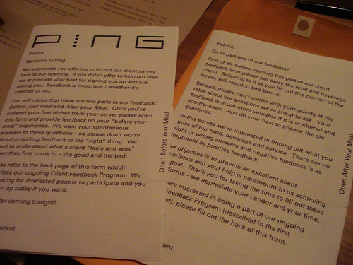
For months, Portland food writers have been frantically swapping gossip about Pok Pok's rumored expansion into Chinatown. Now, Ping has finally opened. And it is right at our downtown bus stop. As a partnership between Ricker and John C. Jay of Wieden + Kennedy, this place has quite the pedigree of cooking chops and hip branding. The future is bright.
Now, you can chalk it up to being a superfan, but as soon as their placeholder website went live, I'd already signed up for their mailing list. As one of the overeager first, A and I were invited to a preview night for the restaurant last Saturday. The look on A's face was priceless - it was like getting asked to head backstage with her favorite band. Sometimes, there's a payoff for being obsessive.
Right when you step inside, it's got that same kind of cool as Clyde Common, another favorite of ours. The kind of cool where you feel hipper for being there, instead of thinking you're not up to par with the other patrons. Let's call it "inclusive cool." But even more than being hip, it feels established, like an old and weathered noodle house. From the wall of antique radios to the vintage tin advertisements, every detail is carefully considered and well-placed. It's how I imagine I'd style a restaurant were I to open up shop.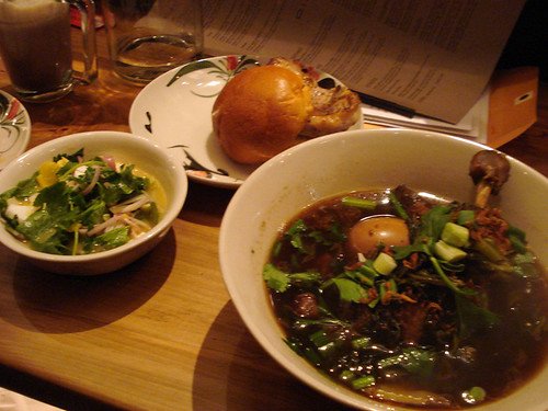
I can already tell Ping is going to enter our "heavy rotation," mainly because nothing on the menu would have seemed out-of-step at Pok Pok. Even though Ping expands the scope to include dishes from Japan, Korea, China, Macau, Singapore, Malaysia and India, everything is prepared with the same attention to native detail and eye-opening flavor. What I can confidently report from our representative "smattering" of their dishes is that the food is Good and Unique. So what did we try? Chicken heart skewers, fish balls, kopitiam toast (coconut egg jam), steamed gai lan, salted duck egg salad, ju pa bao (Macanese pork bun), and pet pha lo (aromatic duck leg stew). Every one a winner.
The chicken hearts had a rich, irony, and essential flavor, while the grilled kopitiam toast made for an unusually sweet and nice starter. We ordered the gai lan (Chinese broccoli) half-accidentally, but ended up pleasantly surprised by how light and flavorful this dim sum staple was prepared. Ping's pork bun was the end-all-be-all of literal interpretation: a whole pork-fried pork chop nestled into a halved, sweet, brioche bun. Pork + bun. Very satisfying. Of everything we tasted, I think the pet pha lo stood out the most. Rich with star anise, the brothy stew played really well off of the pickled mustard greens and chili vinegar accompaniments. My mouth is watering just to write about it.
Well, A and I can safely add Ping to that growing list of crave-worthy Asian restaurants we daydream about. If it weren't for a prior commitment on Tuesday night, we might have already headed back for their official opening, and a for a bowl of the ramen we missed. It may just be that I'm starting to feel a bit of Euro-pub burnout, but 2009 is shaping up to be a year of Asian food. Welcome to the 21st century, right? Still, I'm starting to worry that it might be a tad geeky to get this excited about Asian food. We'll see what my co-workers say when I start bringing in kimchi for lunch...
Monday, February 9, 2009
infographics
Recently, I read my first book by Edward Tufte, Visual Explanations. Brilliant! Tufte's obsession is with improving how we share and use ideas and, to that end, he's written a series of books examining and critiquing the information design of charts, graphs, tables and diagrams. This may sound like I'm starting off a really dry post here, but his book was unbelievably fasciating and really beautiful. Since he couldn't find a publisher who would produce the books to his standards (and that means full-color photos, annotations and moving flaps), Tufte has committed himself to self-publishing. The results are like pop-up books for designers! Just look at this page from the book that explains the importance of scale:
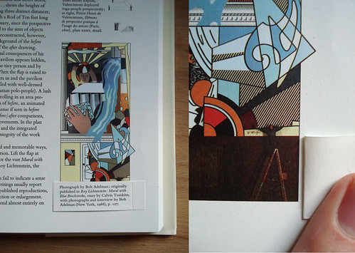 The Lichtenstein mural looks small as it's printed on the left
(until you see the artist standing next to it). It's all relative.
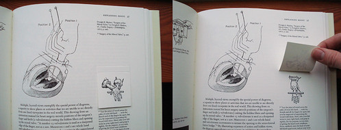
Basically, Tufte shows that the same rules apply to visual information design no matter the subject and, at the base of all of these examples, everything is subjective. Just by omitting certain details or changing the color-coding or scale, Tufte points out how the same data can be used to reach drastically different conclusions. I never thought I'd be particularly interested in the the first epidemiological study of a cholera outbreak, but with the right design, I was enthralled.
Ever since reading Tufte's book, I feel like I've been on the patrol for well-designed charts and diagrams. If you spend enough hours on the internets, you're bound to find something worthwhile.
GOOD magazine has, across the board, pretty exceptional design. I guess that it's what happens when a bunch of design-savvy, future-obsessed progressives found a magazine. Good stuff. As part of their work, they produce really engaging videos for their Transparency series that detail hidden costs and overlooked facts about the world we live in. Just take a look at this sharp clip about water resources:
Hot. Last year, they also launched a brief series of broadsheet-style charts that gave a sort of "state of the union" in the months surrounding the election. Their GOOD sheets applied beautiful design to explaining historically slim election margins, immigration rules in the US, the "first 100 days" of a Presidency, and holiday-season shopping.
While the graphs and charts that GOOD produces tend towards the macro, a new website, called Daytum, gives a stylish way to track the highly idiosyncratic details of your personal life. In early December, I set up my own tracking and have been trying to diligently record some of the mundane things I think and do. In my mind, this is what Twitter and Facebook and all of those social networking sites should have been - just the facts, well-designed, and slightly comical. The holidays lent themselves perfectly to quantification - now I know exactly how frequently I hummed "Little Drummer Boy" to myself (9):

I have to say that after two months of following a few statistics, it can be tricky to keep it spontaneous. When I log in to record one change, it's hard not to end up thinking, "Do I have anything to change on these other charts?" Then it becomes an issue of influencing the results of the "study." Did something actually change, or am I making up a reason to adjust the numbers to keep things interesting? I should ask my sociologist wife about this.
Given the slick design and tip-top usability, it shouldn't be surprising that Daytum is the brainchild of Nicholas Felton, a shockingly obsessive and talented designer who's best known for his Annual Reports. No, not like "really well-done reports for major companies" - more like "really hyper-detailed reports for the minutae of his daily life." Just look at this spread from the 2008 report:

If that seems detailed, you should know that the maps included in the printed version of this year's report can be assembled into an icosahedron globe of his movement patterns. I absolutely love this guy and I'm amazed by how his brain works.
But Felton's definitely not alone in his rigorous self-observation. He was invited by PRINT magazine, along with a few other diligent data recorders, to follow a single week using a medium of their choice. The results, captured in photos, drawings and charts, show everything they consumed. While I found this project clever, the neurotic tracking of certain others can begin to give me the jeeblies. The Quantified Self is a new movement for greater understanding of our lives, beginning with more detailed recording. As you can read in this article from GOOD, its adherents chart their pains, sleep cycles, sex, calories and mood. As much as this stuff fascinates me, I have no interest in weighing my food and counting my breaths. For now, you'll just have to put up with my tracking the foods I wish I were eating. Not that you probably want to know any more than that.
Sorry if this is falling into a bit of rambling, but there is really just so much of this stuff out there to enjoy. If you want - no - if you need more charts, Visual Complexity provides a clearinghouse for visual data mapping. Some of them are just pretty to look at.
There is also this taxonomy of heavy metal band names.
In a long string of web-recorded personal geekery, let's just look at this post as keeping up with tradition.
Monday, February 2, 2009
six more weeks...
 Facts and thoughts on Groundhog Day:
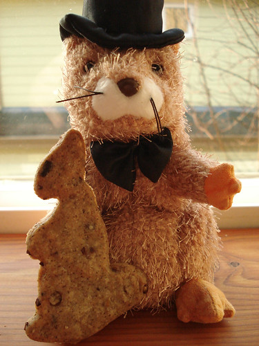
Yes, we made cookies.
Yes, that is my very own groundhog-shaped cookie cutter and top-hatted rodent. I also have a mug.
Growing up, my family celebrated Groundhog Day each year as diligently as any church holiday and I could never figure out why my peers didn't mark the day with cookies and cards like we did at home. I'm not sure if any of us can remember how the festivities began, but they certainly haven't let up over the years. Maybe it had something do with my dad being a librarian; after all, Punxsutawney Phil spends the other 364 days of his year in the Groundhog Zoo at the Punxsutaweny Memorial Library.
Yes, I've proudly visited him there. (We always did a lot of library tourism on our vacations.)
For those of you who don't mark rodent-centric holidays on your calendar (February 2 - remember it for next year!), here's a little run-down: based on German superstition, if a groundhog sees his shadow on Candlemas, then it bodes 6 more weeks of winter. Sure, Spring is technically in about 6 weeks anyway, but this holiday gives the folks of Punxsutawney, Pennsylvania an excuse for lots of top-hats, braggadocio and some pretty epic mustaches. A lot of other cities (all with equally baffling names) boast their own groundhogs and their predictions can vary wildly. I would recommend that they all band together to form some sort of unionized weather service, except that I know the rest of them are impostors. Shubenacadie Sam? Staten Island Chuck? Bah.
If (for some reason) you didn't get up at daybreak to watch Phil's prediction live this year, you can still see it on groundhog.org. The fact that Phil snagged that URL is enough for me to legitimize his prognosticating primacy.
My favorite part of this year's holiday coverage was that GOOD magazine compared him to a soused gambler:
"Phil has a motley track record. At 30% accuracy, he doesn’t even beat the flip of coin; he’s more like a drunk at a poker table: You could make money simply by betting against him."
And yes, that was part of an article using the movie, Groundhog Day, to illustrate complex ideas in economics, physics and theology. Who could blame theorists for trying? That film is fantastic. Last week, I came across an artist online who was illustrating a book of famous Bills and Williams in mock masonic garb called the Billuminati.
Yes, the Bill Murray spread was the best.
And yes, Punxsutawney Phil saw his shadow this morning, predicting six more weeks of winter.


